SCROLL
HELLO
I'm Ry, a multimedia designer.
I'm Ry, a multimedia
designer
Design, motion, and sound—my mind is always exploring the possibilities of these three powerful tools. I've been involved in diverse projects, spanning video editing, branding, 2D motion graphics across various platforms, digital content creation, print design, and OOH design. With my background in music, I never overlook the significance of rhythm in motion.
Enjoy your time here and don't hesitate to GET IN TOUCH
HELLO
SHOWREEL
PORTFOLIO
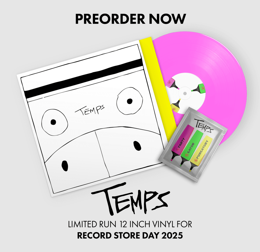
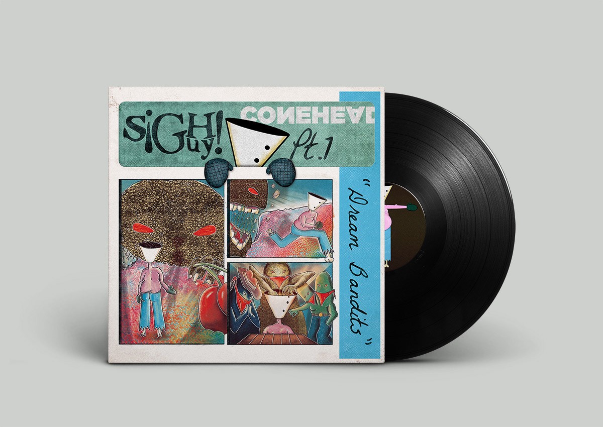
TEMPS | RSD ALBUM CONCEPT
TEMPS | RSD ALBUM CONCEPT
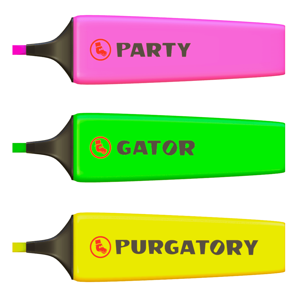
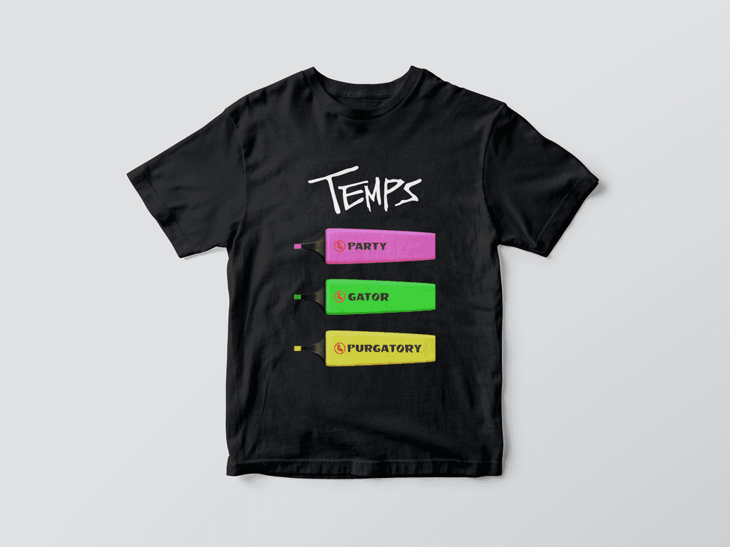
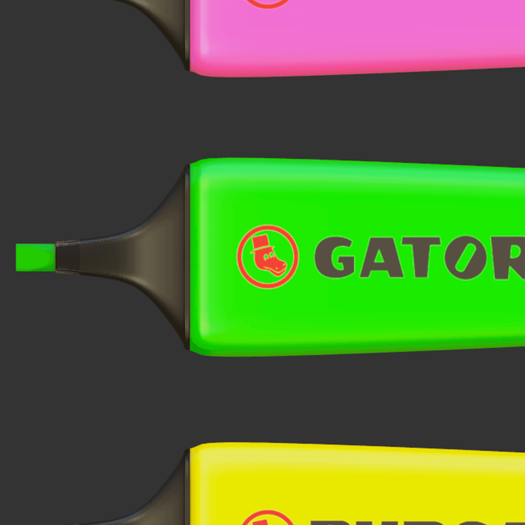
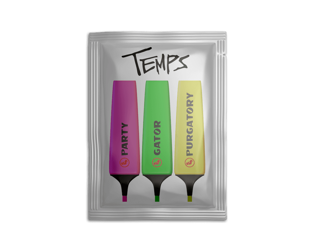
I wanted to capture the whimsical and experimental vibe of Temps, inspired by Acaster's childhood and symbolised by the already iconic "Party Gator."
So, I went for these simple, nostalgic tools with a cheeky nod to Stabilo, hoping to really connect potential fans to the project's imaginative and laid-back roots. And then it hit me: why not make those highlighters a real deal? We could toss them into the Record Store Day Limited 2025 edition vinyl, letting fans dive into their inner kid and colour in the album themselves.
I wanted to capture the whimsical and experimental vibe of Temps, inspired by Acaster's
childhood and symbolised by the already iconic "Party Gator."
So, I went for these simple, nostalgic tools with a cheeky nod to Stabilo, hoping to really connect potential fans to the project's imaginative and laid-back roots. And then it hit me: why not make those highlighters a real deal? We could toss them into the Record Store Day Limited 2025 edition vinyl, letting fans dive into their inner kid and colour in the album themselves.
I wanted to capture the whimsical and experimental vibe of Temps, inspired by Acaster's childhood and symbolised by the already iconic "Party Gator."
So, I went for these simple, nostalgic tools with a cheeky nod to Stabilo, hoping to really connect potential fans to the project's imaginative and laid-back roots. And then it hit me: why not make those highlighters a real deal? We could toss them into the Record Store Day Limited 2025 edition vinyl, letting fans dive into their inner kid and colour in the album themselves.
Credits:
Lead Creative | Illustration | Concept | Design | 3D Renders | Animation
by Ryan Palmer
Credits:
Lead Creative | Illustration | Concept | Design | 3D Renders | Animation
by Ryan Palmer
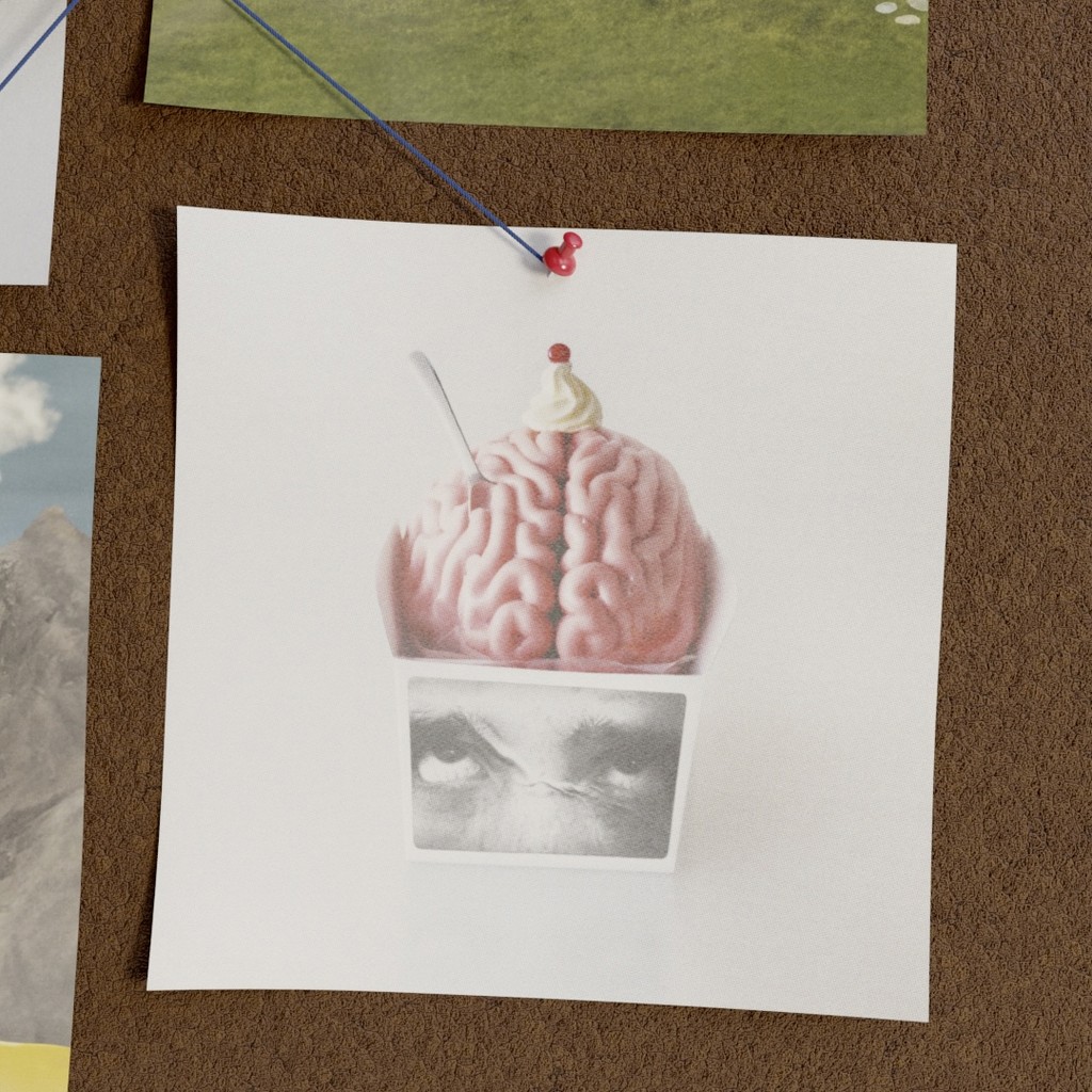
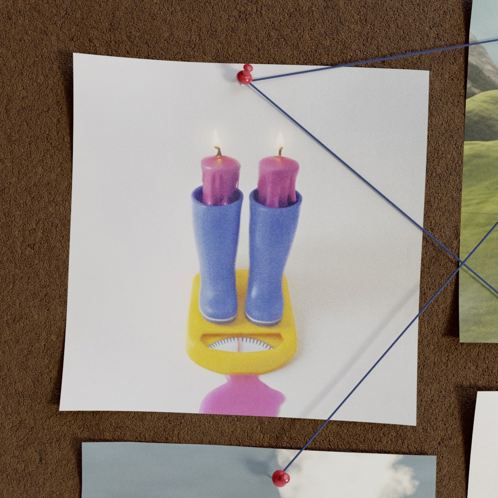
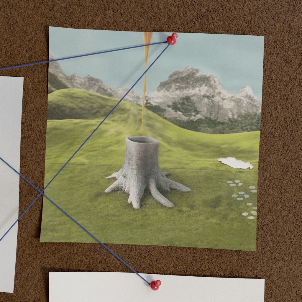
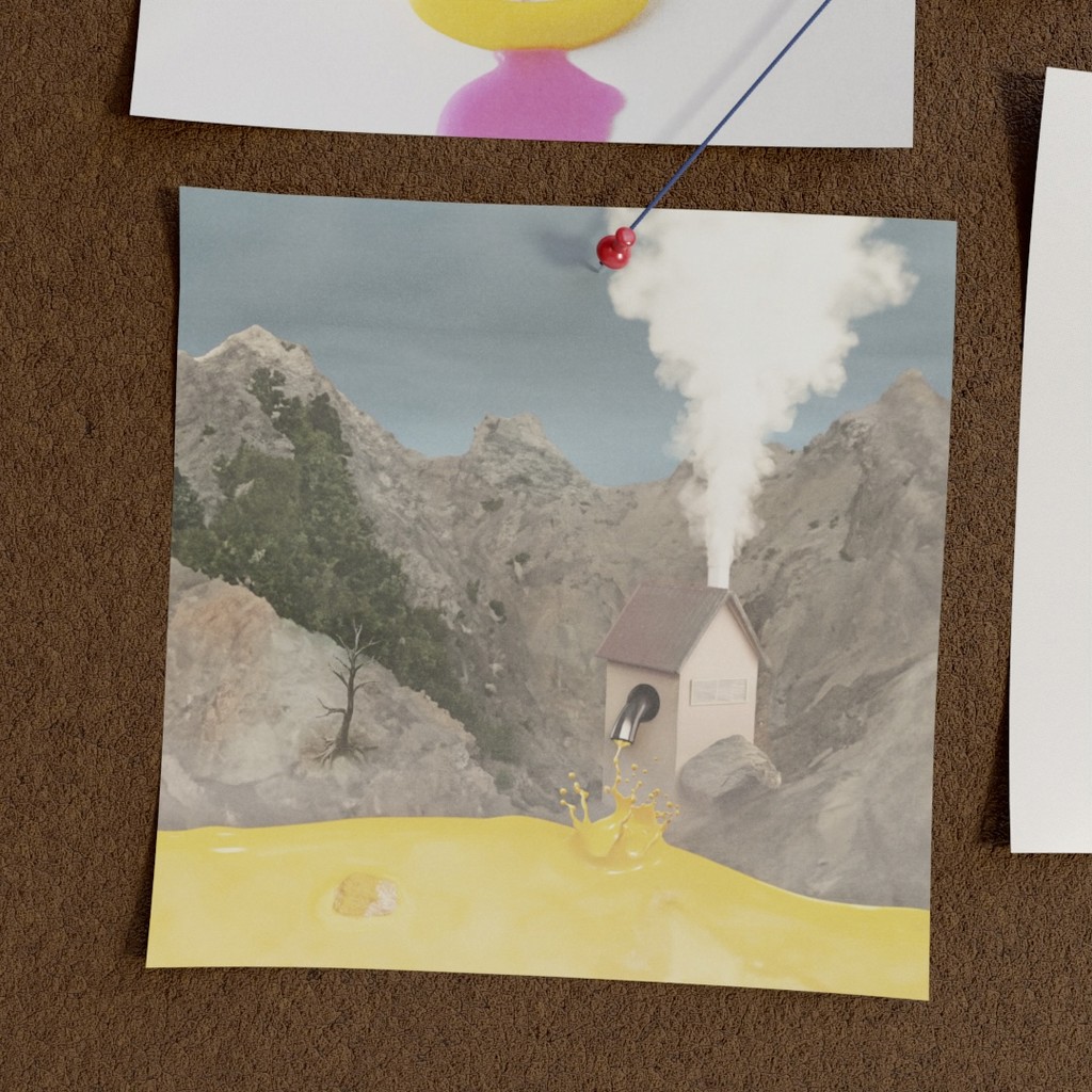
PERSONAL SKETCHES/PROJECTS
PERSONAL SKETCHES/PROJECTS


Credits:
Creative | Illustration | Concepts | Design | Animation
by Ryan Palmer
Credits:
Creative | Illustration | Concepts | Design | Animation
by Ryan Palmer
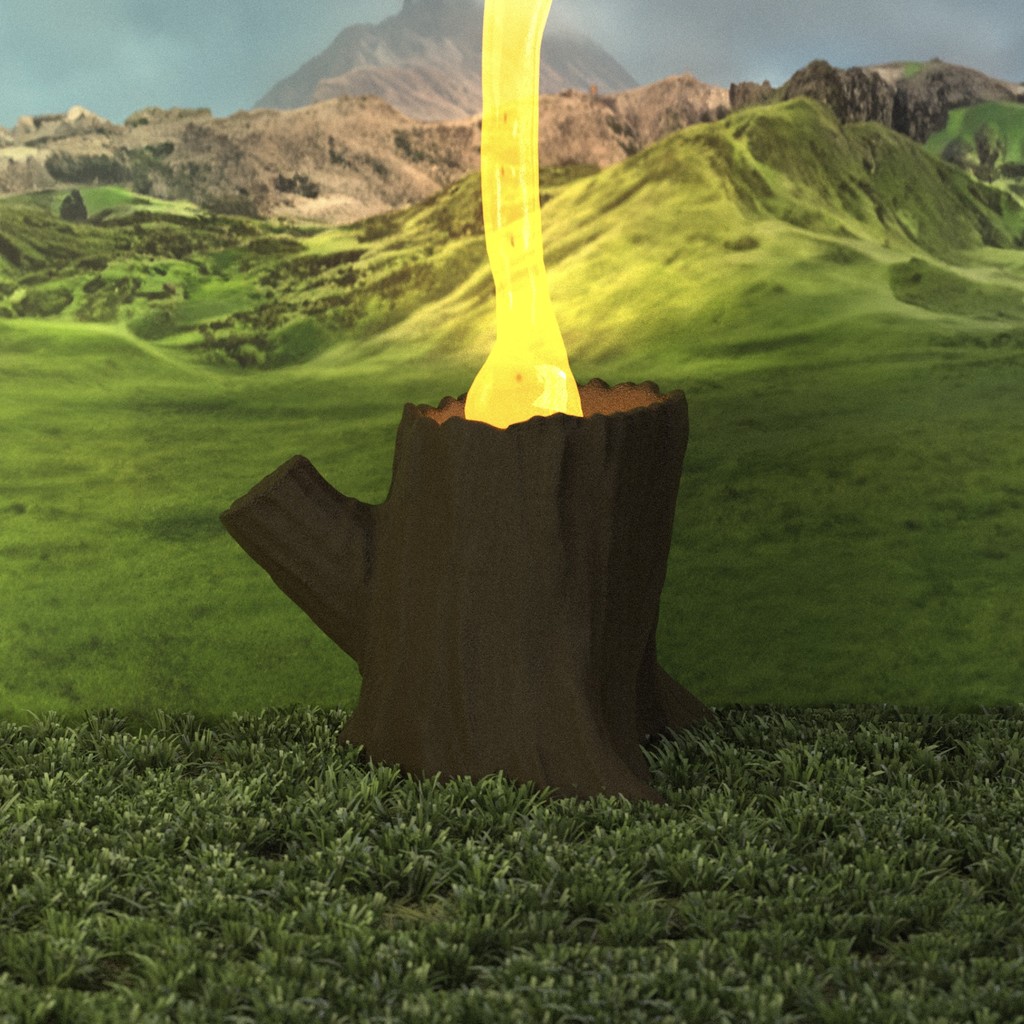
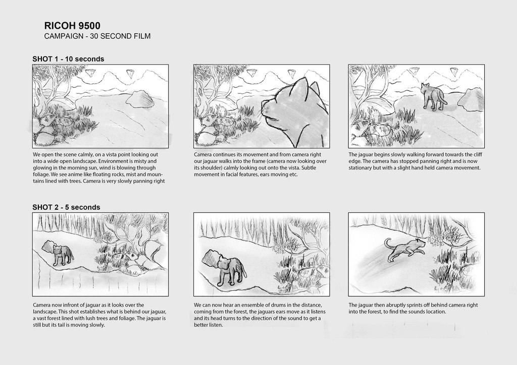
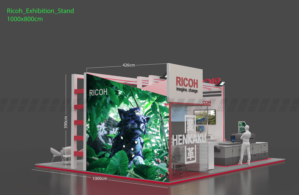
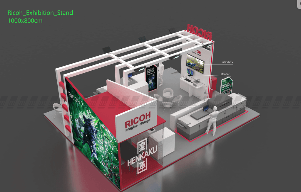
RICOH C9500 CAMPAIGN | EUROPE
RICOH C9500 CAMPAIGN | EUROPE
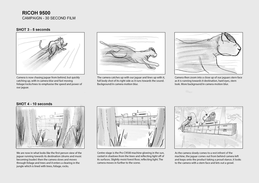
I’m proud to share the Ricoh C9500 campaign video, a project that brought together storytelling, design and technical craft—delivered within a tight three-week turnaround from brief to final delivery. Developed from my original concept and rough storyboards, I was deeply involved in every stage of the creative process. I shaped the story and visual direction, edited three versions of the main video (short, medium and long), and produced a series of teaser edits to build hype ahead of the full launch. Each version was adapted for both landscape and portrait formats to suit different social platforms. I wrote all on-screen copy and designed the custom “fog”-style title treatments, composed and mixed the original soundtrack, and carried out all sound design. The colour grade was completed using bespoke LUTs to achieve a cohesive, cinematic finish.
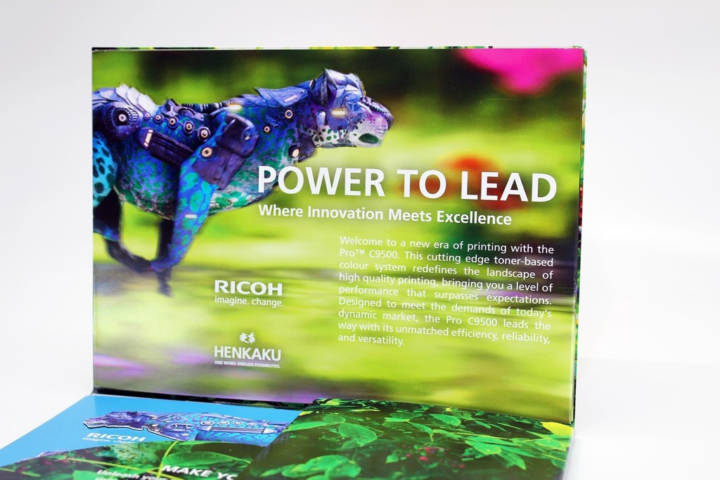
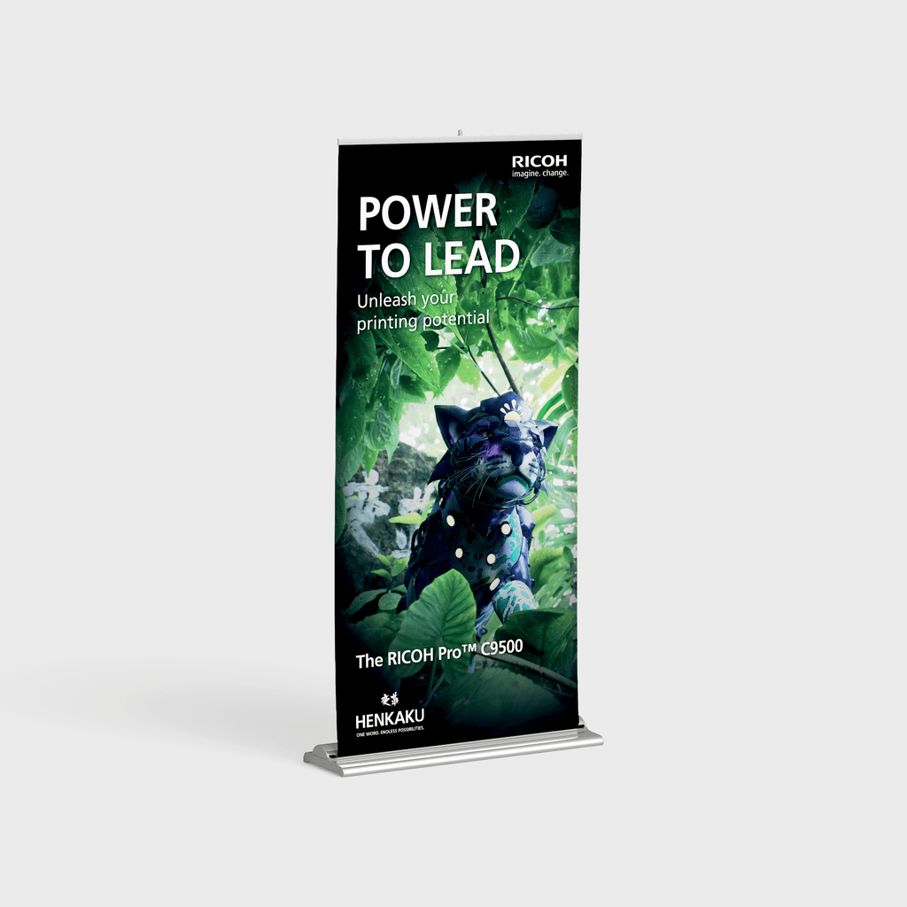
In addition to post-production, I sculpted and textured the 3D “Henkaku” kanji rock and created the custom 3D textures for the Jaguar’s armour. I coordinated with two freelance character designers and riggers, and worked closely with Billy, our Unreal Engine specialist, ensuring the creative vision was fully realised despite a constrained client budget. This video formed part of a wider project featuring four animal-themed campaigns—Jaguar, Dragon, Eagle and Owl—each designed with consistent visual and narrative themes. The entire campaign was launched at drupa 2024, the world’s largest trade fair for print and cross-media solutions, held every four years in Düsseldorf.
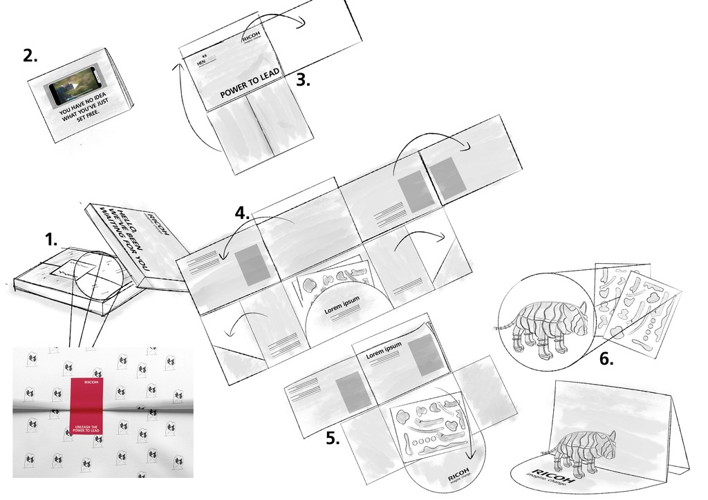
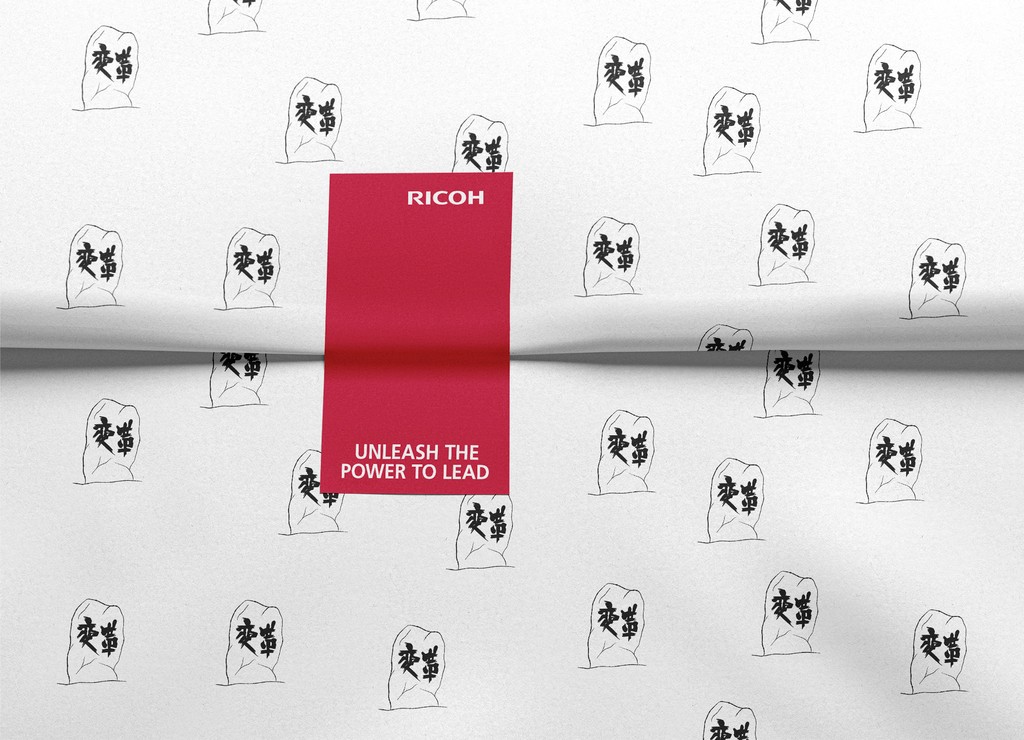
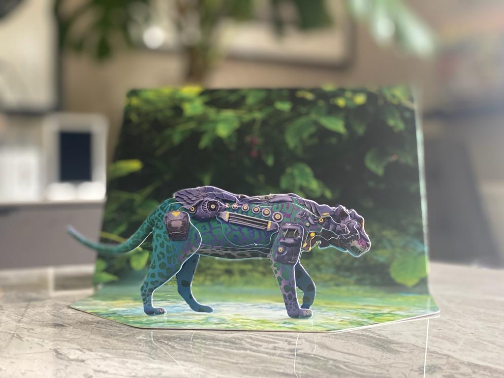
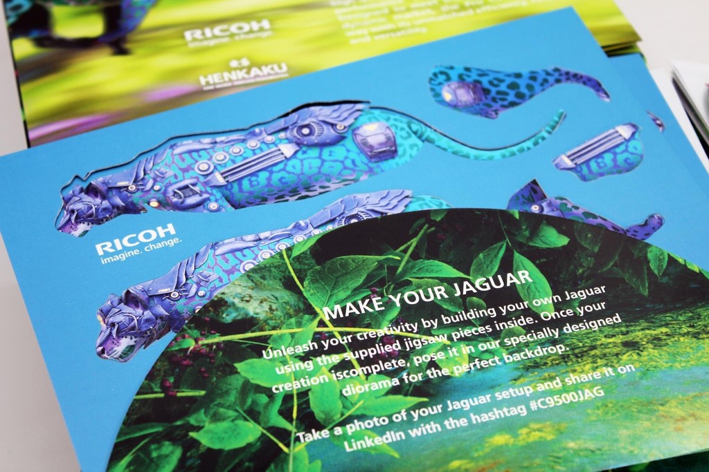
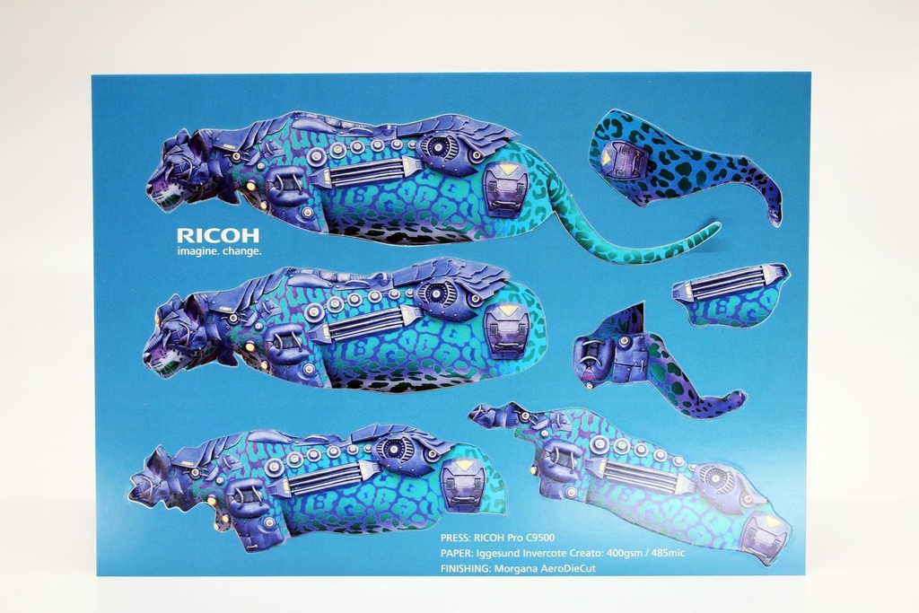
To extend the experience beyond the screen, I also designed a printed direct mailer from the ground up. This included the structural design, artwork, and finishing details—ensuring that the special print effects unique to the Ricoh C9500, such as clear ink and metallics, were fully incorporated and showcased. The mailer transformed into a 3D puzzle diorama of the Jaguar, offering Ricoh’s customers a memorable, interactive and tactile experience that reflected the innovation behind the machine itself.
I’m proud to share the Ricoh C9500 campaign video, a project that brought together storytelling, design and technical craft—delivered within a tight three-week turnaround from brief to final delivery. Developed from my original concept and rough storyboards, I was deeply involved in every stage of the creative process.
I shaped the story and visual direction, edited three versions of the main video (short, medium and long), and produced a series of teaser edits to build hype ahead of the full launch. Each version was adapted for both landscape and portrait formats to suit different social platforms. I wrote all on-screen copy and designed the custom “fog”-style title treatments, composed and mixed the original soundtrack, and carried out all sound design. The colour grade was completed using bespoke LUTs to achieve a cohesive, cinematic finish.
In addition to post-production, I sculpted and textured the 3D “Henkaku” kanji rock and created the custom 3D textures for the Jaguar’s armour. I coordinated with two freelance character designers and riggers, and worked closely with Billy, our Unreal Engine specialist, ensuring the creative vision was fully realised despite a constrained client budget. This video formed part of a wider project featuring four animal-themed campaigns—Jaguar, Dragon, Eagle and Owl—each designed with consistent visual and narrative themes. The entire campaign was launched at drupa 2024, the world’s largest trade fair for print and cross-media solutions, held every four years in Düsseldorf.
To extend the experience beyond the screen, I also designed a printed direct mailer from the ground up. This included the structural design, artwork, and finishing details—ensuring that the special print effects unique to the Ricoh C9500, such as clear ink and metallics, were fully incorporated and showcased. The mailer transformed into a 3D puzzle diorama of the Jaguar, offering Ricoh’s customers a memorable, interactive and tactile experience that reflected the innovation behind the machine itself.

Credits:
Lead Creative | Illustration | Design | Editing | Ident Animation | Sound
by Ryan Palmer
Creative Agency: Paperhat Creative
Credits:
Lead Creative | Illustration | Design | Editing |
Ident Animation | Sound
by Ryan Palmer
Creative Agency: Paperhat Creative
RICOH | EMAIL SLIMMERS
RICOH | EMAIL SLIMMERS
Credits:
Lead Creative | Illustration | Design | Editing | Animation
by Ryan Palmer
Creative Agency: Paperhat Creative
Credits:
Lead Creative | Illustration | Design | Editing | Animation
by Ryan Palmer
Creative Agency: Paperhat Creative
London Tea Company | World Duty Free
London Tea Company | World Duty Free
Credits:
Animation
by Ryan Palmer
Creative Agency: Paperhat Creative
Credits:
Animation
by Ryan Palmer
Creative Agency: Paperhat Creative
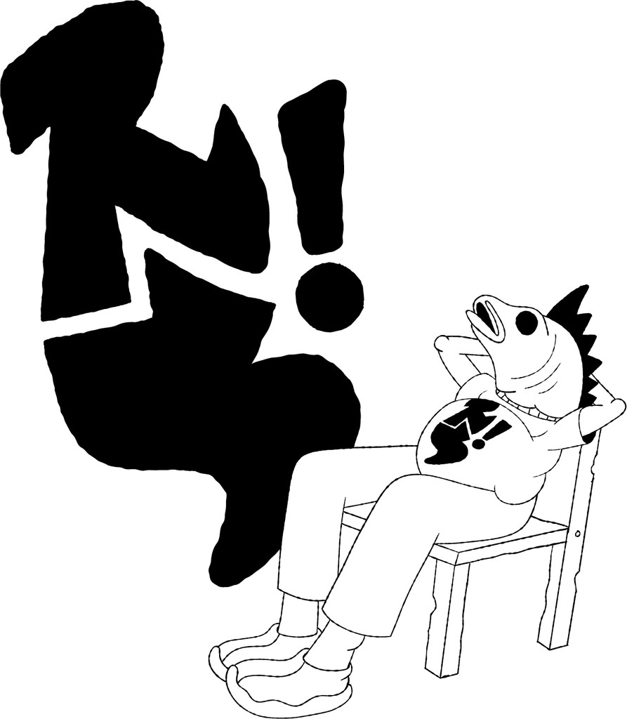
Red Snapper | Rebrand & Menu Design
Red Snapper | Rebrand & Menu Design
Red Snapper were in need of a refresh to their overall brand and menu design. I embarked on transforming their fishy character into a grittier, more artisanal vibe. The initial step was crafting a snappy logo, incorporating the brand's initials "RS". Pairing this with a script-style font and with the tagline "Born In Thailand, Made Here" tied everything together, resulting in a cohesive and compelling identity.
Red Snapper were in need of a refresh to their overall brand and menu design. I embarked on transforming their fishy character into a grittier, more artisanal vibe.
The initial step was crafting a snappy logo, incorporating the brand's initials "RS". Pairing this with a script-style font and with the tagline "Born In Thailand, Made Here" tied everything together, resulting in a cohesive and compelling identity.


Credits:
Illustration | Design | Animation
by Ryan Palmer
Credits:
Illustration | Design | Animation
by Ryan Palmer
Credits:
Illustration | Design | Animation
by Ryan Palmer
MUSIC &
SOUND DESIGN
Credits:
Music & Sound Design
by Ryan Palmer
Credits:
Music & Sound Design
by Ryan Palmer
Ry Palmer Design 2025